We’ve been designing, and you’ve been deciding. The graphic designers themselves weigh in with their reactions about which of their logos received the most votes while taking us behind the scenes of their design process.
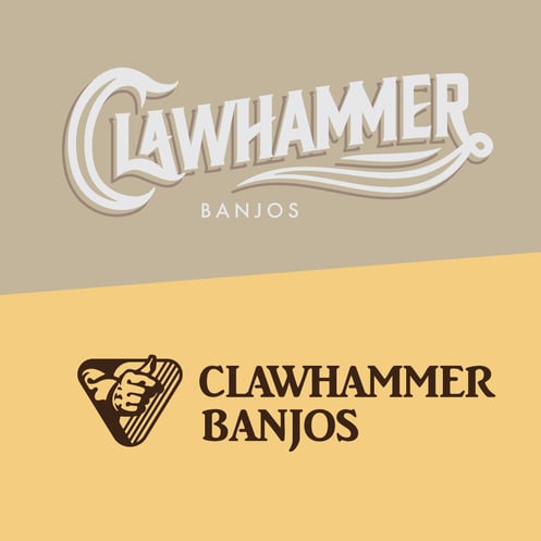
Clawhammer Banjos
The first Clawhammer Banjos logo was inspired by the classic tradition of flowing, custom type with ample swashes and swirling peripheral elements that could be seen burned into the headstock of a banjo or decorating an envelope of new strings. The muted palette is to reference worn, chrome hardware and the silvery, matte texture of a banjo head. The second Clawhammer Banjos logo is inspired by the intersection of Art Nouveau style and folk music, featuring letters with more personality and an illustrative mark. The primary brown and yellow are meant to convey the music’s earthy roots, while the secondary pink, teal, and gold represent the artistic, Nouveau-inspired art of festival tee-shirts and posters. My expectation was that people would lean towards the first logo (which did end up with more votes) because it was more classically and universally “beautiful” and concise in its shape, while the second logo was more specific and experimental, making it less relatable and universally understandable.
-Caleb, Graphic Designer
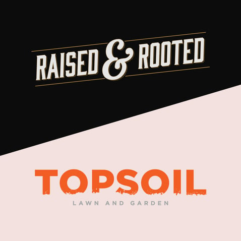
Topsoil
I created my first concept, Raised & Rooted based off of one of the primary purposes of this exercise, utilizing styles of design that we’ve either never tried or don’t get to use very often in our day-to-day workload. Vintage, rustic designs are something I’ve always found to be interesting, but due to the popularity of that style in the “hipster design scene” they’ve become somewhat cliché and overused. We Design, You Decide seemed like a perfect opportunity to scratch that itch and create something within that same vein just for fun. Topsoil was a much more grounded approach (see what I did there). If my first concept leaned more towards the idea of “I’m going to do whatever I want”, then I wanted my second design to come from a more realistic direction, which to be honest is probably why it won. I decided to make a more modern approach with this logo, opting for a simple sans serif typeface and a bright color palette.
In the end, I think I had more fun creating the concept for Raised & Rooted, but it makes perfect sense to me why Topsoil was the more favored choice among voters. I’m satisfied with how both concepts turned out, and am very thankful that we were able to utilize this opportunity to stretch our creative legs a little bit and work on things slightly out of our comfort zones with no consequences.
– Andrew, Graphic Designer
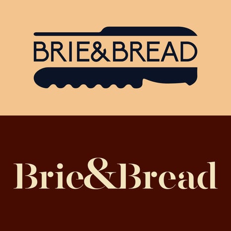
Brie & Bread
"What would a logo look like for sandwiches made with charcuterie board ingredients?”
In the type heavy logo, I played with the Gestalt law of closure, which refers to the brain’s ability to complete incomplete forms. I used this law by removing the light weights on the letters. Next, when designing the knife logo, I noticed that a lot of the logos in the charcuterie industry leaned heavily on the image of cheese or cows. I wanted to stay away from this, since it felt overdone to me. I realized that cheese knives and bread knives have very different, interesting shapes. I created the knives, then arranged them around “Brie & Bread”.
As for the results, I thought that the type heavy logo would be a fan favorite and win the challenge. Initially, I preferred it to the knife logo. To my surprise, the knife logo ended up winning by a landslide! The Facebook results were 100% in favor of the knife logo and 0% for the type heavy logo. Instagram was pretty split, but the knife logo pulled out the win. I think the knife logo would be perfect for a hipster restaurant, the kind of place that would charge way too much for a sandwich because of the high quality of ingredients. The type heavy logo feels more like a fine dining restaurant or a fancy grocery store brand.
Overall, I love seeing numbers and statistics of my designs. It makes it feel more “real” and shows how it survived in the wild. It also reminds me that there is a real person on the receiving end of the advertisements and my design work.
-Claire, Junior Graphic Designer
Get in Touch