
In our world, design is everywhere. It’s ingrained in our everyday life and we may often overlook it. A specific area of design that gets taken for granted is typography. At its core, typography is the way that letters are designed and arranged. Before studying design, I didn’t realize that someone had to actually sit down and create the letters. This process includes making decisions on the overall look of each letter and their relationship with one another. Beyond just individual letters, the spacing between the letters and each line of type has to be defined.
Sounds a bit tedious, right? So why do we care? Each typeface has a personality and sends a specific message when used. As designers, we need to be conscious of these choices and ensure the correct message is being communicated. Outside of the profession, understanding the effect of these messages can help us make educated decisions. There are many different classifications of type, but we will take a closer look at Serifs, Sans Serifs, Script, and Blackletter.
Serif Typefaces
Serif typefaces are those that have “feet”, meaning they have a smaller line attached to the end of a bigger line, on a letter or symbol. These originated first in the Latin alphabet with inscriptional lettering, or words that were carved into Roman stone. Recognizable Serif typefaces are Times New Roman or Bodoni.

Sans-Serif Typefaces
A Sans-Serif is a typeface without Serifs. Meaning, it does not have “feet”. Sans-Serifs first appeared on jubilee coins from 1809, but became popular in the early 20th century as a new era of designers, architects, and artists rejected conventional letterforms, wanting to reflect the development of technology. The blog you’re reading right now is set in a Sans-Serif typeface. Some Sans-Serif typefaces you may notice are Futura and Avenir (at Zipie, we especially enjoy Avenir).

Script Typefaces
Script typefaces have become increasingly popular. They are inspired by the fluid handwriting of cursive. Often times these typefaces mimic the polished writing styles that used brushes or calligraphy pens. Other typefaces appear a bit more rough and natural. Popular script typefaces include Snell Roundhand and SuperFly.

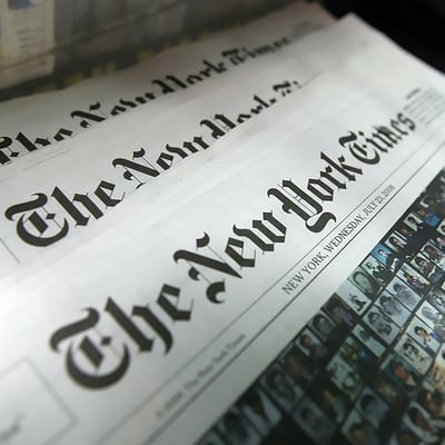
Blackletter Typefaces
Based on early manuscript writing, Blackletter is ornamental with dramatic variations of thick and thin lines. While Blackletter is not easy to read in a body of text, it is used as for headlines or display purposes. You may notice this typeface in diplomas, newspaper mastheads, or heavy metal bands. Examples are Lordish and Osgard.
Typography is an area of design I completely nerd out over. The effort that goes into creating type and the history behind it is fascinating. Good design is invisible, so the next time you see beautiful letters out in the world, I hope you take a moment to appreciate them.
-Claire Monkman, Jr. Graphic Designer
Sources:
https://en.wikipedia.org/wiki/Serif
https://www.typotheque.com/articles/a_brief_history_of_sans_serif_typefaces
https://www.sitepoint.com/the-script-typeface/
https://www.sitepoint.com/the-blackletter-typeface-a-long-and-colored-history/
Image Sources:
https://www.rd.com/food/fun/coca-cola-logo-red/
https://newrepublic.com/article/142439/bret-stephens-isnt-problem-new-york-times-op-ed-page
https://www.shutterstock.com/image-photo/new-york-september-7-christian-dior-611861633
https://www.complex.com/music/best-spotify-playlists/
