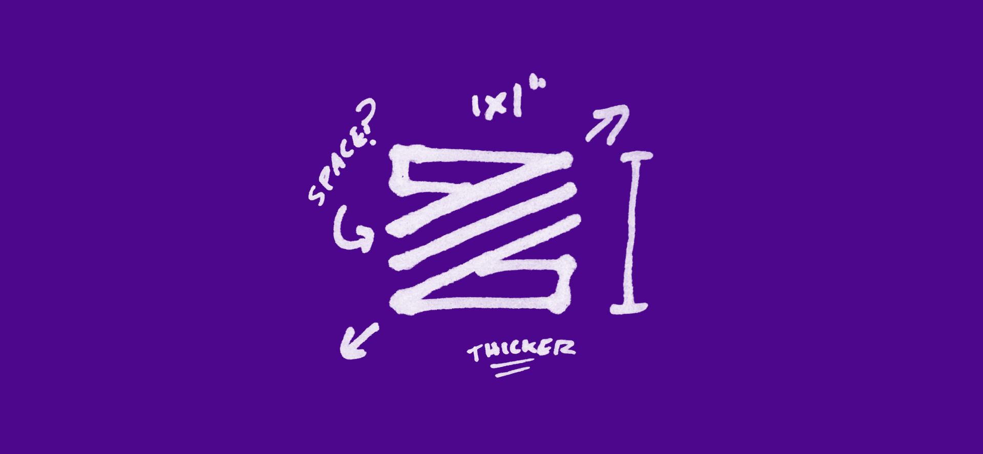
The argument could be made (and has been) that a logo can be anything. Its core purpose is to act as shorthand for your business, and all of your business attributes become attached to it over time, regardless of its visual details. And I would agree that there is some truth in that argument. After all, plenty of businesses have thrived despite having “bad” logos. But what isn’t always obvious are the struggles that take place behind the scenes with these “bad” logos. Without an optimized logo, you could be fighting against it more often than you’d like.
Your logo in print
I used to work as a pre-press designer for a screen printing company, and I’ve seen countless logos come through that had to be redrawn, simplified, or otherwise altered, sometimes quite dramatically, just so that they could be printed with one color at three inches tall. This ended up costing our clients extra for the design time spent on optimizing their logo, and it cost them a certain degree of consistency and recognition thanks to the changes to their logo, however faithful it was to the original. Specialized production processes like screen printing, embroidery, promotional product printing, and countless others shine most with simple, readable shapes.
These are places where your logo will be representing your businesses. Even if your business is primarily digital, it’s worth it to plan for physical outputs as well. You never know when you might be asked to sponsor an event, or when you might be in a position to offer swag items at a conference, business cards to potential clients, or signage for a brick-and-mortar location.
It’s got to thrive in pixels
While print outputs certainly run the gamut of sizes, from 12-foot billboards to centimeters-wide pencils, the digital landscape offers just as much variety, and must be equally considered when developing your logo (arguably even moreso, in today’s digital world). How small and unobtrusive can your logo be on your website? How does it translate as a favicon? Is it recognizable as people scroll through their social media feed? These are questions to be asking when developing your logo.
Tips for logo functionality
Avoid multiple colors, or at least make sure that it reads well with one color. A good example is the Starbucks logo. It appears almost exclusively in one color (green on a white background).
Don’t use gradients. This goes for drop shadows, blurs, reduced opacity, or any none-solid shapes. You won’t always be guaranteed legible output, even in the best scenarios. Keep to solid shapes and counter shapes. If it can’t be printed on the side of a pencil, don’t do it.
Keep it square. This doesn’t mean a literal square, of course, but it’s a good reference shape. If the logo reads nicely in a square (like social media profile images, favicons, app icons, etc.) then you’re good to go.
Pro Tip: This rule applies primarily to the logo mark. It’s perfectly fine for the mark and logotype together to extend horizontally or some other way.
Have multiple file types on hand. If you haven’t realized, you’ll likely be needing to partner with a professional to design your logo and identity system. They’ll know all of the optimal file types to provide you with and will be able to explain which ones work best for a given scenario.
The most important thing to consider in developing a simple, functional logo is: your logo can be anything, just don’t try to make it everything. More clutter and more color will only bring more headaches. The kind of headaches everyone behind the scenes will feel, even if it’s not apparent from the outside. Save yourself the headaches. Partner with someone who knows logos and has helped cure countless companies’ headaches.
Have questions about how to create the perfect identity for your business? Need help with branding your business? Send us a message and we'll be right back with you!

